Monday, November 29, 2021

Final Fantasy VII Remake (PS4)


Final Fantasy VII Remake is, as the title suggests, a remake of Final Fantasy VII. However, a re-imagining would be the more appropriate description since it is not a complete remake of the game. It only covers the Midgar portion of the story, which wasn’t that long in the original game. Instead, this game expands upon the story in order to give us a 40 hour game, as well as changing a few things along the way. It’s got amazing reviews and the consensus is that it is a great game, although there is some divide with many not liking it.


The original was a PS1 game and now, three generations later, we see the same locations but using all of the advancements in over twenty years. Boot up the game and from the very first scene it looks phenomenal. It’s actually really exciting to see updates of locations that you remember, which looks familiar, and yet so much prettier.


The story starts off pretty much exactly the same as the original. You follow Cloud, a SOLDIER mercenary for hire who is paid by Avalanche in their quest to bomb a mako reaction. Avalanche is described by many as eco-terrorists, they have the best interests for the planet but is misguided. Their goal this time is to stop the abusive usage of mako, the planet’s life energy, and prevent Shinra from harvesting it as an energy source. After this exciting and explosive first chapter, it’s when all the filler starts coming. While it isn’t all bad, it does make the game go at a much slower pace than the original.


The combat system is nothing like the original. Instead, it’s like a massive improved version of Final Fantasy XV’s. It is real time and pressing square will have your character attack. As they attack, this builds up the ATB gauge. Once you have at least one full block then you can either use abilities (special moves), magic or items. Those actions will use up the ATB gauge and having items and magic tied to that can be inconvenient at first. You are also able to hotkey four actions for quick access, otherwise you can pull up the menu which will cause the onscreen action to slow a crawl, allowing you time to select.


The other major element to the combat is hitting the enemy enough to pressure them and then eventually stagger them. Normal attacks do chip damage, while abilities and magic do a normal amount of damage. Once you stagger an enemy, it stops them from blocking or attacking, as well as giving you a damage multiplier to pile on the damage. Additional features of the combat system includes being able to dodge and block. the ability to swap to other characters is instantly available and is crucial since each character has a unique role distinguishing them from other party members.


Magic is tied to the materia system. Which spells you can use is determined by which materia you equip the character with. Fighting with them equipped will level them up and give you access to higher tiers of the spells. You will constantly need to adjust your materia load-out to cope with bosses, which is fine most of the time, but can also feel tedious at others. It’s an addictive system that is replicated with weapons. Use a weapon long enough and it will permanently unlock one ability unique to that weapon for the character to use, no matter what is equipped.


As flashy as the battle system is, it has a high learning curve. You can’t brute force your way, you can’t button mash and tying item use to the ATB bar is overly restrictive. Given enemies seem to have high agility and have ranged attacks, you feel like you don’t have much control over when you take damage or not. Boss battles are difficult, especially with their own gimmicks, high use of unblockable moves and their insane speed of unleashing attacks at times which makes it tough to actually land a proper hit with decent damage. You can’t be aggressive at all sometimes, which slows down the pace of the game.


The hybrid turn based action battle system works part of the time. In others, it is a mess that is too fast paced for the turn based aspect to work as it gets too hectic, but it is too slow paced for the action aspect to work as the dodge and block abilities aren’t as strong as you would expect in an action game. As a result, boss battles can feel like a mess and a massive damage sponge thanks to the stagger mechanics.


The game is at its worse when it constantly takes party members away from you and you’re forced to fight using only one character. All aggro is on you, and when you had a proper party, at least you can swap characters but here, you’ll get stun-locked. Even normal mode will have massive difficulty spikes.


Aerial combat has one of the worst implementations ever. They’re okay when you can use a ranged character but there will be plenty of times when you are forced to fight them using a melee character. These enemies fly out of range so that character becomes absolutely useless. If you use magic, it might accidentally hit an obstacle and so you’ve wasted your ATB bar and MP. Or how about using ice magic only for the enemy to roll away since there is a delay in the damage being applied? It’s frustrating.


Enemies roam the environment so you are never surprised when you enter combat. There is no separate battle screen although this can make you fight the camera in tight spaces. The camera is horrendous at times, especially when you’re in a restricted area. This happens even with boss battles so you can’t easily dodge since you can’t see. The game loves to force you to fight multiple enemies at once without giving a good option for crowd control attacks.


The game may look like it is huge and presents you with options but it is still effectively a linear corridor walker. This isn’t necessary a bad thing but when it is so obvious that the developers want you to play in a very specific way, THEIR way, in both exploration and combat, it can feel overly restrictive. It doesn’t help when the corridors are extremely narrow.


The padding is very real since the game extends dungeons to three to four times what they should be. What doesn’t help is that Midgar is bland. It’s a city so there are a lot of enclosed areas, walls and corridors. We get none of the open world vistas which make travelling through dungeons so enjoyable. Here, every train tunnel looks the same and every mako reaction is similar, it gets bogged down after a way. There are annoying gimmicks like holding down triangle to high five or sneaking out without hitting a loose object on the floor and making a sound. How is this essential or fun? The game wants to be taken seriously but you get these stupid idiotic moments that breaks the immersion with its instant fail mechanics. While it’s a call back to the original game, it’s just so overly sensitive that it’s not fun.


The game continues on the trend that started with Final Fantasy XV where during certain sections, your characters are forced to slow down in order to squeeze in tight spaces, crawl, climb up ladders or just walk for no reason. It’s pointless and aims to waste your time. Forced slow walking for no reason at all feels like padding, especially with all the filler story elements. The frequency at which the forced walking or shimmying occurs, and not for an atmospheric reason, or even for hiding loading, is obnoxious. It can’t be even called masking loading screens because it is so frequent and obvious when it happens every minute or so in a linear corridor dungeon with barely any enemies.


There are a number of sidequests but they’re not designed very well. They’re infinitely better than than the banal fetch quests of Final Fantasy XV, but it’s still stuff like finding unmarked objects on the map, or go to this place to grab an item. While the maps are small enough that it usually isn’t too difficult, its aim is still to waste your time like so many other things of the game and that can be quite insufferable.


Despite only being around 35 to 40 hours in length, things feel like they are dragged on for too long and the plot is overstretched. It ends up being muddled and lacks focus. You don’t know what the objective is because it keeps getting distracted with pointless crap. This isn’t even mentioning the changes made to the story to insert Sephiroth earlier, or add some random mystique, which can feel like a lame attempt at fan service. The finale is a massive ten hour long dungeon, filled with annoying “puzzles” where you just flip levers and run through the same corridors. Then it is a boss rush, which at this point, completely burns you out and feels so tedious.


The ending completely changes the story. While it was hinted upon throughout the game, the additions, the final chapter, and the boss, is Kingdom Hearts level of ridiculousness. It’s a typical convoluted mess of that game series that aims for visuals rather than sense or gameplay. Adding this sort of deus ex machina type of plot device is extremely lazy since it shows that the writers couldn’t figure out how to properly close the game, or find a good way to actually re-imagine the story.


Overall, Final Fantasy VII Remake is a bloated game with way too much filler. It stretches four to five hours of the original into forty hours and not in a good way. A bit of expansion would be good but in the hopes of making a “typical” forty hour RPG, the content is stretched out way too thin filled with pointless fluff like climbing ladders, shimmying on ledges and other “expanded” content. The combat system is unique but takes a lot to get used to and doesn’t quite work as a turn based or an action game since it is lacking functions in both areas. The game is extremely pretty although when it is just based in Midgar filled with dreary run down shanty town like structures, sewers and corridors within buildings, everything eventually looks the same. It is typical Square Enix to focus so heavily on the flash but not the substance and it shows in the game’s cutscenes, writing and combat.

----------------------------------------------

For other reviews, have a look at this page.

Sunday, November 28, 2021

Toy Review: Transformers Generations War for Cybertron Kingdom Ark (Titan)


Review: 
#691
Name:  Ark
Brand:  Transformers
Allegiance:  Autobot
Line:  Generations - War for Cybertron:  Kingdom
Year of Release:  2021
Size Class:  Titan
Mold Status:  new

PACKAGING AND ACCESSORIES:


As part of the Titan class, Ark comes in a massive box, with a very nice piece of gigantic artwork on the front.


The back is a bit more simple as it just shows the stock photos and some gimmicks (which isn't much as far as Titan class figures goes).


There are several accessories included, such as two Golden Discs two big blast effects (which separate into six small individual ones), the navigator globe, an Optimus Prime mini-figure, and a collector card (that you can peel the sticker off to reveal the fate of the character).


One of the Golden Disk is the one that was included in the Voyager space probe, and the other is the Vok version.


The navigator globe looks pretty good, considering it is more of a throwaway accessories in that you'll use it once and then leave it stored forever afterwards.


The Optimus Prime figure is cast in a solid red with a yellow base, despite it's small size, there are still recognizable sculpted details.


The Optimus Prime figure is really easy to be lost.  Why?  Because it is absolutely miniscule, above is a comparison against Core Soundwave (which is a fairly small figure itself) but you can see how it dwarfs it.  At this point, just like the Wheelie and Brains mini-figures included with SS DOTM Shockwave, you wonder if they really should have included such small pieces of plastic with these.

MAINFRAME (TELETRAAN-1 MODE):


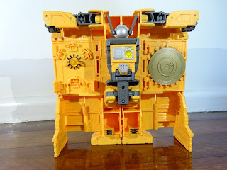
Let's diverge and focus on Mainframe first, the "extra" figure that comes with Ark, as is somewhat common on Titan class.  The neatest thing about Mainframe is that he transforms into Teletraan-1, which is really cool!


It loses a lot of its shine (and this is a common theme with the set) when you look from behind and see how hollow he is.  It's basically a panel with the sole aim of looking respectable head on from the front and gives up from any other angle.  It's absolutely disappointing.


The biggest problem with the design is that it is comprised of single panels that clip together, which makes the whole thing feel insubstantial and flimsy.  It's a poor effort and obvious cost-cutting.


Ignoring the hollow and cheap feel, one cool feature is that the various accessories, such as the two Golden Disks and the navigator globe, stores in Mainframe (in both modes), so you don't have to worry about putting it away and losing it.


Mainframe is approximately between Deluxe and Voyager size, above is a comparison against Siege Sideswipe and Siege Optimus, and you can see he's about smack bang in between in terms of actual size, and also mass.


As Teletraan-1, Mainframe is more scaled towards Legends / Commander / Core class, above are Legends Swerve and Beachcomber (I didn't have any Core Autobots from the latest line available).  There's no denying it's a cool concept, but the execution is lacking.

MAINFRAME (TRANSFORMATION):

Getting Mainframe to robot mode is easier than the reverse, this is because the transformation scheme relies heavily on panels.  You effectively detach the various panels and fold them all upon each other to get the robot mode.  The bottom half of Teletraan-1 forms the legs, while the arms are spread over the top.  The middle portion forms the torso, with the panels on either side folding into his back.  When going from robot mode to Teletraan-1 the first time, you'll probably feel some frustration in lining the panels up to click them into place.

MAINFRAME (ROBOT MODE):


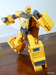
Mainframe's robot mode is, to be honest, quite decent in his looks.  He's got the classic G1 blocky aesthetics, although his legs are too chunky to the point of dominating his overall profile a bit.


For a Transformer that relies so heavily on panels, it's no surprise that he is loaded with kibble, and it's kibble of that kind that gets in the way.  Right off the bat you can see how the middle portion of Teletraan-1 folds up, and then sticks all the way down to behind his knees.


The neat thing is that the two Golden Disks and the navigator globe continues to be stored, and you didn't even have to remove them for transformation.


The head sculpt is great and one of the best things (and also rare nowadays, unfortunately), is the lightpiping in the head which works wonderfully well.


In terms of size, he's about Voyager height but the cost-cutting is even heavier compared to most Voyagers.  You already knew about the thin hollow Teletraan-1 mode, but it's not much better here as all his limbs are hollow to the point of making Mainframe feel much lighter than he should for a figure this size.  However, the plastic used is strong so he still feels sturdy at least.


The cheap design shows up once more, and this is a really puzzling decision.  You might notice why Mainframe above has his arms kind of folded inwards.  This is because the kibble underneath his forearms stick out and hits the panels on his back.  So you either have the arms straightened to his sides, or fold his elbows inwards. It's such an easy fix but the designer couldn't be bothered or there wasn't enough budget, and this is a prevalent theme for the whole set.


An alternative is that you can fold the panels out to the sides, which could look worse though the panels don't snap into place.  This also means that the hollow forearms are really apparent when viewing him from the back (which is not very likely).


Apart from the restrictive arms, his knees are also restricted too as the panels on his back get in the way. It just seems all these little things which could have been avoided aren't fixed and were ignored in order to push the figure out.


In terms of articulation though, he has joints for his head, shoulders, elbows, waist, hips, knees and ankles.  He lacks a weapon though.


Mainframe is a neat idea, but hindered by a lot of small flaws.

ARK (ARK MODE):


And now, onto the flagship figure in the Kingdom line, the Ark... who transforms into the Ark.


This is such an iconic vehicle in the Transformers lore and it is faithfully replicated here, he looks absolutely stunning.


There are three fold down stands so that it can easily stand on a flat surface.


There's plenty of details here, from the turret guns to the bridge to the tower.  These all positively adds to the transition from a simple 2D animation to a 3D figure.


Unfortunately, the cost-cutting is very apparent here as well, even in Ark mode.  The rear sides are hollow (some might argue that it is required for transformation, but the counterargument is that it is very easy for the designer to add panels to hide it, similar to the leg transformation) and the back of the tower is hollow.


The Ark can also be annoying to snap every piece into place properly.  The rear half doesn't seem to have a strong enough connection, so it can sag when you lift the Ark up (standing on a flat surface is okay).


The other cool thing is that you can have the Ark stand upright as if it is about to blast off.


And needless to say, as part of the Titan class, Ark is massive and towers over all Transformers in conventional size classes.  Above is a comparison with Leader Optimus Primal and Deluxe Sideswipe for a size comparison.


For something this big, there are little gimmicks, which feels like another sign of the laziness or rushed aspect.  At the back is a ramp that is springloaded.  You would also expect that you can attach the blast effects to the thrusters, nup, they are too loose to stay in place.


While opening the Ark up (requires unclipping several pieces) reveals the bridge, and a navigator globe which is removeable so be careful it doesn't get lost (more than likely it is rattling away when you open the figure).


This is where the super tiny version of Optimus comes into play as you can peg him on any of the six rectangular slots.


The bridge is actually formed by Mainframe, who had transformed into a block so you can take him out (and leaves a big hollow piece that you can fit a small figure in if you wish).


The biggest negative is the apparent cheapness and cost-cutting, it's fine to cost-cut it would have been much better if it wasn't so blatantly obvious, and while the result is still impressive, it could have been more so.

ARK (TRANSFORMATION):

As you can expect, transformation has to be relatively simple for something of this size.  It's easier to go from Ark to robot mode than the other way around.  The back pretty much unfolds to form the robot legs and the cool part is as you are unfolding it, the panels are jointed in such a way to cover up the hollow sections.  The front has a few panels that you have to fold out away which can be annoying as they're on friction joints with limited movement, so you can easily pop them off.  While the arms unfold outwards, with several tight ratchets that you need to lock onto place.  It's a solid transformation considering its size, if quite a bit uninspired.

ARK (ROBOT MODE):


Ark's robot mode is impressive, despite the relatively dull transformation, the resulting robot looks fantastic.


As mentioned in the transformation section, a neat aspect is how the panels behind his shins and forearms fold out when you'll pulling the limbs out to fill in the gap to help reduce the hollow look and feel.


Nevertheless, this is the cheapest Titan class figure we've had yet.  The torso is completely hollow, with only a panel and some underlying plastic to help strengthen that section.


The head sculpt is awesome, and just like Mainframe, it has lightpiping which works remarkably well.


As you can see, Ark towers over most other Transformers in robot mode as well.


He is also roughly a similar height with other previous Titans like Omega Supreme and Scorponok, but feels cheaper than both.


Mainframe is designed to be taken out when Ark is in robot mode, which explains the gap in the torso area.


For such a big figure, there are surprisingly no gimmicks in robot mode.  The hands themselves at least are partially articulated.


Articulation is solid, he has joints for his head, shoulders, elbows, wrists, waist, hips, knees and ankles.


The ankle tilts actually do a fantastic job of keeping him stable.  The other benefit of being lighter than other Titan figures is that he is more flexible in terms of keeping an action pose.


The lack of a proper weapon that he can hold in his hands hurts.  Of note is that when you first open the packaging there are two pieces that you must attach yourself.  These aren't mentioned in the instructions but they attach to his knees.


While we've never seen the Ark transform or this robot form before, it suits the alternate mode perfectly.


The robot mode, just like Ark mode, is serviceable in that it looks good but lacks play value.

OVERALL:


It just feels with Ark that the designer / Hasbro has a great concept, being Teletraan-1 and the Ark spaceship, and then decided that was enough to carry the whole thing.  As a result, we get something that looks great at first glance, but then that's it, it lacks play value and substance.  The mediocre transformation, the many small flaws here and there like hindering articulation or lack of play value, and the excessive hollowing, even more so than you would expect something of this size and in comparison to before, makes Ark feel like a figure that's high in hype, but underwhelming in hand.  It's still looks good but that's about it.

-----------------------------------------------------------------

For other Transformers reviews, have a look at this page.

(As an Amazon Associate I earn from qualifying purchases)
Blogger Widget